GE Imaging in the Cloud
Imaging in the Cloud
Visual and Interaction Design
General Electric’s UX Center of Excellence (UXCOE) is a group of design product and technology professionals tasked with innovating and pushing boundaries and then filtering that knowledge and experience down and into their various businesses across aviation, technology, healthcare, etc. When I joined the team, I was asked by GE to do a concept project to expand the vision for digital medical imaging at least 5 years into the future.
If you’ve ever worked in a highly regulated market (finance, education, healthcare) —you’re familiar with the speed of change—or rather, how slowly things change. Systems are antiquated, people are too busy to learn new systems, and changing those systems is both expensive and risky. That risk is exactly what prompts the constrained response most businesses and governing bodies have to disrupting and innovating for the better.

Our team set out to look at what the future of digital medical imaging looked like - and how GE would look to solve the issues currently associated with the world of radiology and oncology. What would integrated, more ideal systems look like in five or ten years?
The disparity the team found in the conditions and technology currently available in different environments was significant. For example, if a hospital had set up the infrastructure, then radiologists will have access to digital imaging; alternatively, some clinicians, even in well-established primary care facilities in Canada and the US, were limited as their team were still forced to use films for diagnostic work, and have to send images to each other in envelopes.

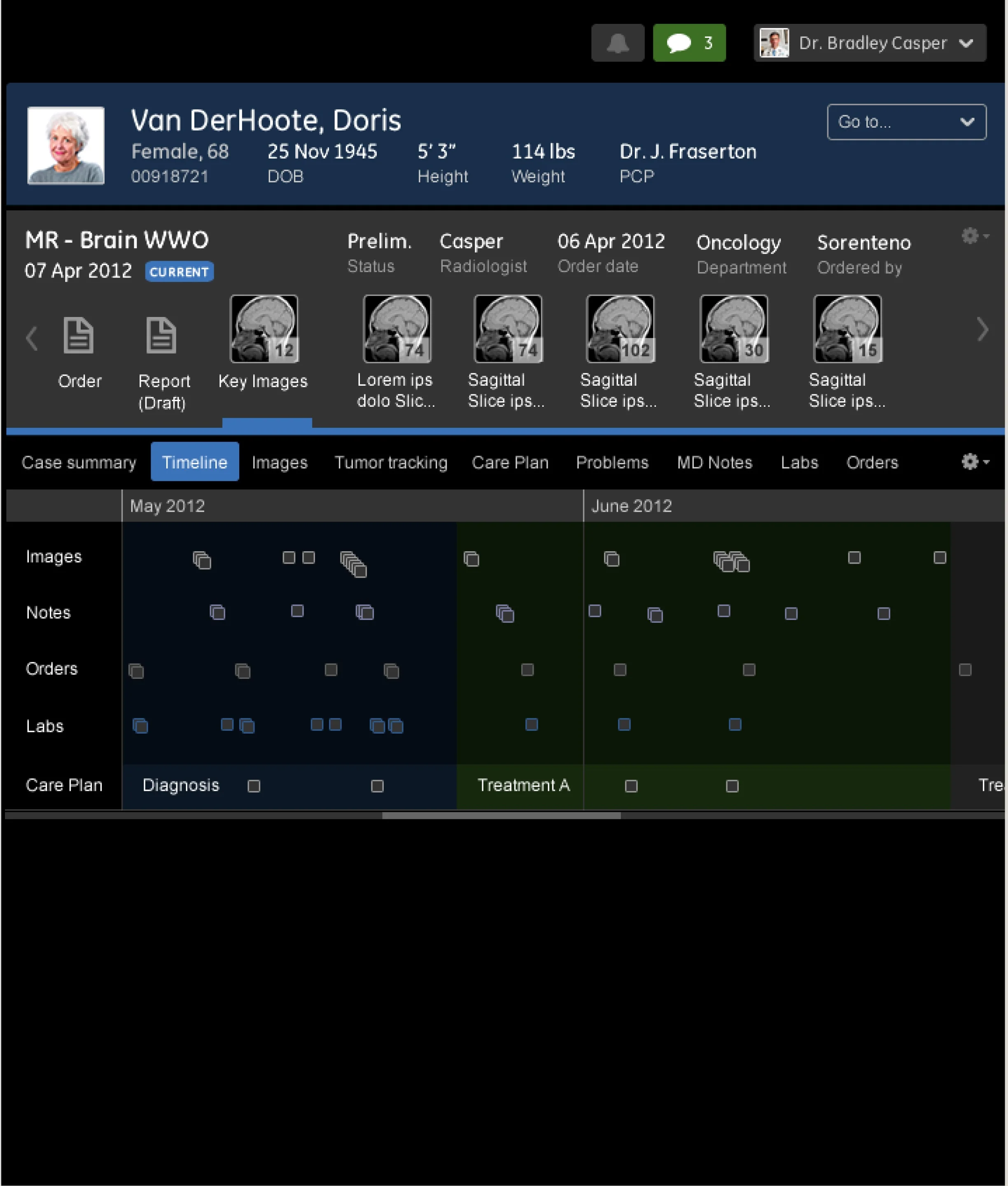
The image on this book cover shows a digital imaging specialist — perhaps a member of an oncology unit — using four different systems to form their opinion on the progress and present condition of a single patient.
If they are working on screens, most radiologists work in darkness. Their eyes need to adjust, their pupils need to dilate properly to be able to see the slight differences in the images and notice irregularities that identify various diagnoses. Of course, in order to properly diagnose a complex condition like cancer, a full understanding of the health of the patient, including a look at their medical history is needed. In this image, the screen on the far left contains the blood tests, visits, and clinical notes from sometimes years of appointments.
Healthcare Information Systems (HIS) are not well-integrated. It is most likely that the screen on the far left in this image is on a different server, perhaps uses a completely different infrastructure to store data and cannot speak to the system that holds the imaging data on the right hand screens. HIS are usually white, data-dense and provide as much information to the user as possible — notoriously, they look very alike.
a rare case for visual design
The research done by our team showed that users had serious lag in their work because of the readjustments their eyes would have to do as they moved between these data-dense screens and the subtle grays and blacks of the images they were using for diagnostic work.
It strained their eyes and made them slower and less effective, some radiologists even said they worried they might miss something in an image because their eyes weren’t well adjusted. This was a rare occasion when the visual design of the HIS was actually a huge factor effecting clinical outcomes.
Meanwhile… frog design was working with GE’s UXCOE to develop the IIDS - Industrial Internet Design System.
“Working with executive leadership, frog developed a vision for the software user experience and designed digital products for the core business, leading to a large-scale design system that increased the speed and efficiency of future design efforts”

Though the “bootstrap-inspired” flat visual design style of the above screen feels a bit generic now, the idea of reusable components for speedy delivery of data-dense screens was revolutionary in 2012 and, according to frog these initiatives “sped the launch of remote monitoring and diagnostic software for several mission-critical products, including myFleet and myEngines. UXCOE won an IDEA Gold award in 2012 for Design Strategy.”
I was one of the first designers inside of GE to test the IIDS, feeding back to frog about using the components and working with the system was critical to the development of the IIDS.

Spending weeks working only at night in the dark, I developed a visual design system built entirely of grays and subtle blues. The idea was that the style of the system worked better for radiologists because the HIS would have the same light-density as their medical images, allowing their eyes to work less hard.
I ensured that the hierarchy matched the context of the workof the HIS was critical as well - with the most specific and detailed information to the right, clinicians could drill down from left to right as they glanced right for detailed diagnostic work on the images themselves.
Messaging and communication were also a key focus, and built into the fabric of the data, the radiologists could imagine a world where the majority of their communication was recorded and accessible asynchronously, instead of phone calls and pagers, they’d have integrated secure messaging.


This enhanced worklist allows for a clear single point of entry for all key functions. From the home screen, users could assess and manage worklists, create or apply protocols, as well as access individual cases, messages, alerts, review boards, clinical resources and collaboration tools.
The initial feedback from radiologists was very positive - they loved it and they wanted it as soon as possible.